Replacing factory floor guesswork with clarity, driving +8% OEE.
Altos runs production at serious scale. At that volume, one untracked hour of downtime or a missed batch registration isn't a small thing - it shows up in revenue. I designed the digital system that replaced the guesswork. Four roles across the organisation, each with their own view - built around what they actually needed to do their job, from the factory floor up to the executive suite.
My Role & Process
My Role
Lead UX Designer - End to End UX ownership
Team
PM, PO, Engineering (IOT, Development), Testing
Duration
10 Months (May 2021 - Mar 2022)
Tools
Figma, Dovetail, Miro, MUI component library
I led UX end-to-end across all four roles - research, synthesis, IA, interaction design, and UI. The PM handled stakeholders, developers built. Every decision the user touches was mine.
After the kickoff, I proposed a process weighted toward research - the domain was technically complex, and while secondary research had already been done by the business, I needed to understand it properly before designing anything. I ran a discovery phase before sprints started, then transitioned once high-fidelity screens began to stabilise.

The Problem Overview
Altos manufactures tools, parts, and mechanical pump components at scale. The sensors and PLCs were already running - machine data was being captured. But it had nowhere useful to go. Operators logged batches by hand. Downtime went unrecorded until it was already affecting output. Supervisors spent their shift chasing status across the floor instead of acting on anything. Executives had no way to compare performance between sites. And the IoT infrastructure itself was managed informally, with no real tooling behind it.
The data wasn't the problem. What was missing was a coherent layer to make it visible, trustworthy, and usable - across four roles, each working at a different level of the organisation.
How might we give every role the right view of production - without adding to the cognitive load of an already demanding environment?
Operational Efficiency: Target: increase OEE (Availability × Performance × Quality) by 5-7% within two quarters of launch
Operator Experience: Measurable improvement in operator CSAT scores
Process Automation: Eliminate manual database registration at shift end
01
Research & Discovery
Understanding a world I'd never worked in
Designing for a factory floor is different. The physical environment shapes every decision. I wanted to run Day in the Life research but it was rejected, so I built up the context a different way - videos, photos, operators at work. Enough to understand the environment and speak the language before going into research.
Terminologies
View
I characterised the conditions under which operators would use this application. These weren't abstract considerations; they directly determined visual design choices that came later.

Lighting: Natural light outdoors, well-lit indoors - but variable depending on shift and station
Noise: High background noise from machinery - no audio feedback could be relied on and high distraction
Viewing distance: Varied - operators often glance from distance, not sitting at a terminal
Device: Tablet in landscape mode (1194×834px) - not desktop, not phone
Light theme selected - reduces light reflection impact in mixed lighting
Critical states via colour, not sound - semantic system for alerts and status
High-contrast data visualisation - readable at a glance and at distance
8-column tablet grid - 8 Column & 8px base grid optimised for the target device
Process :
Interview Plan
View
I conducted 5 semi-structured interviews with machine operators (5+ years experience, multiple locations - to avoid location bias).
"I start by logging in and tuning the machine. Before I send my day report, I check whether I hit my target. The registration at the end - that's the part I hate. It takes time, and we always make mistakes when we're tired."
- Machine Operator, Interview Participant, Synthesised Quote
"When there's an issue with the machine, we don't always know how to log it correctly. So sometimes we just don't. Then the supervisor asks why the downtime wasn't recorded and we're explaining it all from memory."
- Machine Operator, Interview Participant, Synthesised Quote
Supervisors, executives, and admins weren't interviewed directly - their needs came out of the stakeholder sessions.
Head of Plant
No data-driven view of operator performance. Accountability relied on memory and end-of-day verbal reports.
Cross Plant
No way to compare OEE across plants or track trends. Performance reviews were manually assembled and always delayed.
Infrastructure
IoT assets, edge gateways, and users managed informally. No central tooling to configure, audit, or update the infrastructure.
02
Define
What the research and briefs revealed
I worked through the interview recordings by tagging, building an insight table, and clustering. From there, personas and journey maps followed naturally.
Process :
Analyzing Research Data
View
Output :
User Group Persona
View
User Journey Map
View
Four problems - three in the operator experience, one in the supervisor layer - were quietly pulling down OEE, satisfaction, registration accuracy, and downtime capture.
The Executive view extended that impact further - cross-plant visibility gave leadership the confidence to roll the platform out across multiple sites, and a clear way to spot and act on underperformance. The Admin role kept the whole infrastructure running reliably underneath it all.
Operator
Operators had no live view of anything - line status, batch progress, performance. Targets were kept in their head and only confirmed at shift end, long after it was possible to do anything about it.
Operator
Registration was done by hand at the end of the shift - rushed, error-prone, and landed exactly when operators had the least left to give. The highest-friction task in the shift.
Operator
Most downtime went unrecorded because operators weren't sure what was worth logging. The business had no real picture of what was actually causing lost output.
Supervisor
Plant performance, operator output, batch status, trial age - the data existed, but it was manual, fragmented, and always behind. No single view to act on any of it.
03
Ideation
From problems to solutions
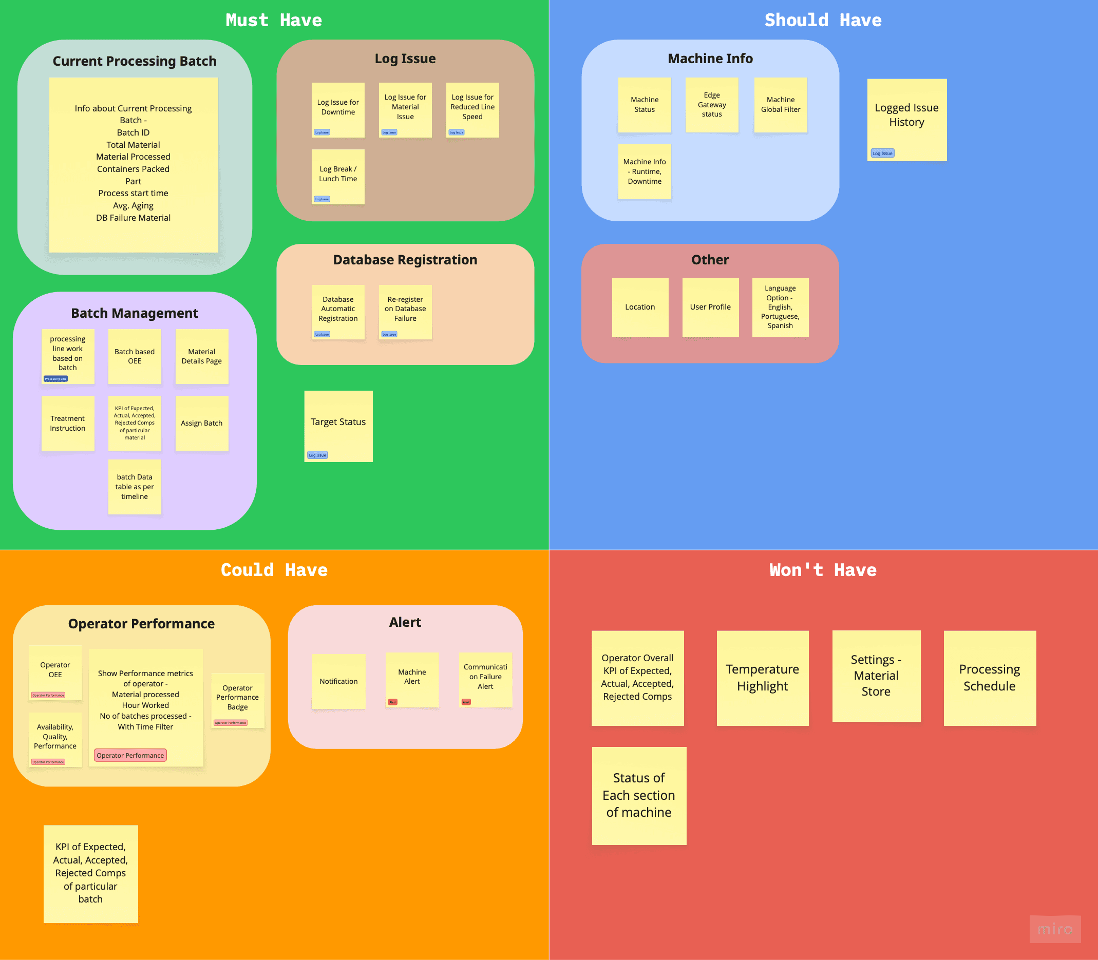
With the problems confirmed, the challenge shifted from understanding to deciding what to build. I ran a structured ideation process to make sure every design decision that followed was grounded and linked to research - not assumed.
Brainstorming
→
Affinity
Mapping
→
MoSCoW
→
Solution
Validation
→
User Flow
I ran this full structured ideation process for each of the four roles — Operator, Supervisor, Executive, and Admin. The showcase below focuses on the Operator role, where the research was deepest and the design decisions most consequential.
The brainstorm opened up a wide feature surface across both roles. Affinity mapping pulled it into six clusters - Machine Info, Current Processing Batch, Operator Performance, Log Issue, Batch, and Alerts. Those clusters became the input for prioritisation
Process :
Brainstorming
View
Affinity Mapping
View
I ran a prioritisation session with the PM and stakeholders, putting each feature cluster through three filters - does it address a confirmed research insight, does it fit the timeline, does it serve the business goal. That decided what shipped in v1 and what waited, rather than leaving scope to assumption.
Before moving to IA and user flows, I mapped every prioritised feature back to the need it was solving - user need, JTBD, pain point, or business goal. To make sure nothing was floating free and every decision could be defended.
Process :
Solution Validation
View
User Flow
View
04
Design
Design decisions that shaped the product
Rough sketching iteration was done to clear thoughts on layouts, widgets & components, their hierarchy and position
Altos had brand guidelines but no design system. I built basic design tokens and a visual guide from those foundations, then adopted MUI as the component library and customised it to match the brand - reducing dev effort and making handoff cleaner. Design implications derived from Environment profiling was also taken into consideration for creating visual design guide & components.
Output :
Visual Design Guide
View
Components
View
Each role operates at a different altitude - different information, different actions, different mental load. A shared platform would have meant compromising for everyone. RBAC wasn't just a technical requirement; it was the design principle that held the whole system together.
Three of the four key problems lived in the operator experience - progress tracking, batch registration, and issue logging. The fourth sat in the supervisor layer. Additional features from the MoSCoW were solved alongside.
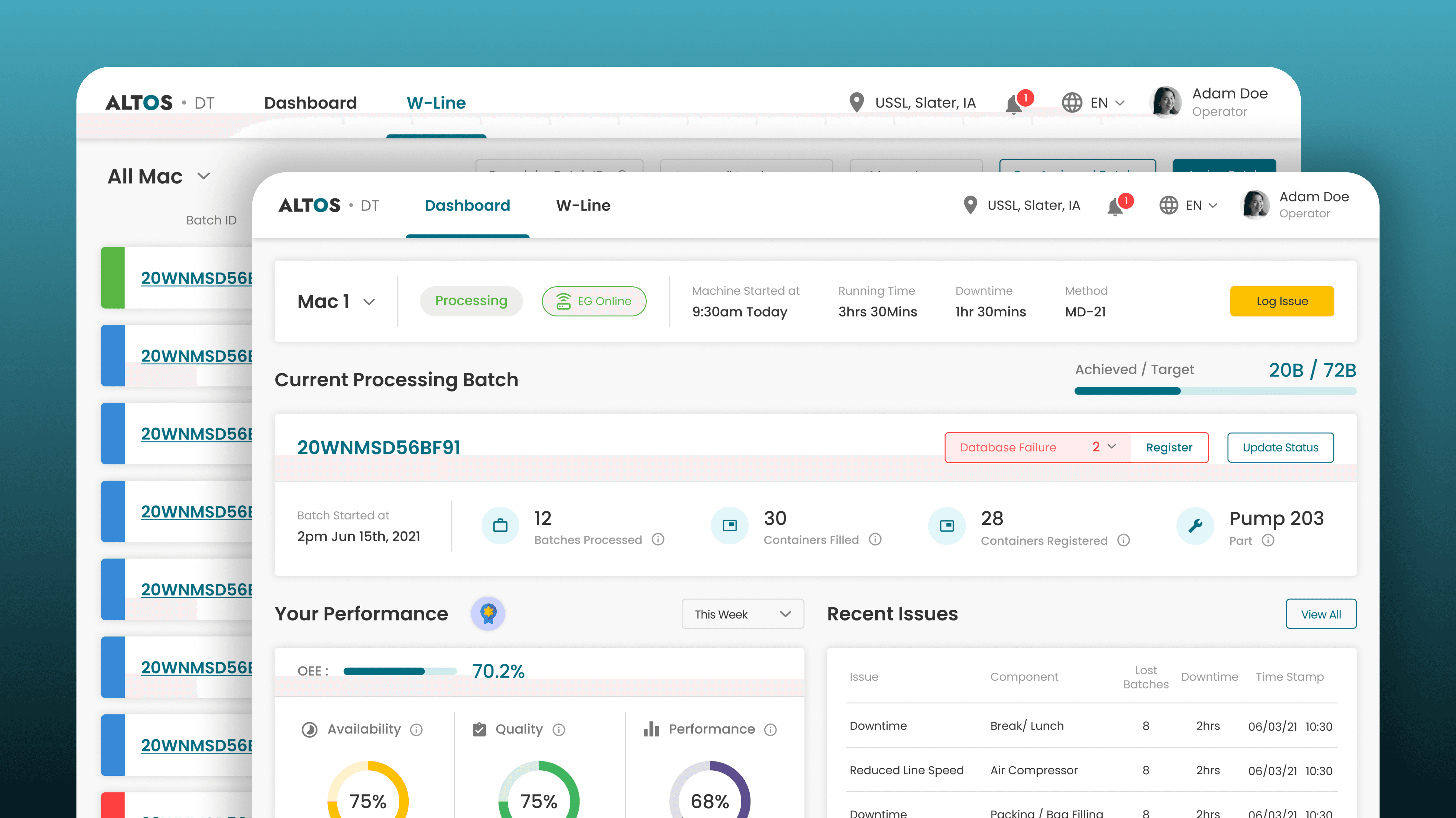
Operator Dashboard Hierarchy - What Appears First and why
Problem / Challenge
Operators carry three questions at different urgency levels - is the line running, am I on target, how am I doing?
I structured the dashboard around that urgency hierarchy - a compact Machine Context Bar at the top, followed by the target progress bar & Current Processing Trial widget, then operator performance below.
Also other problems and features as mentioned in MoSCoW and Solution Validation were also taken into consideration & solved.
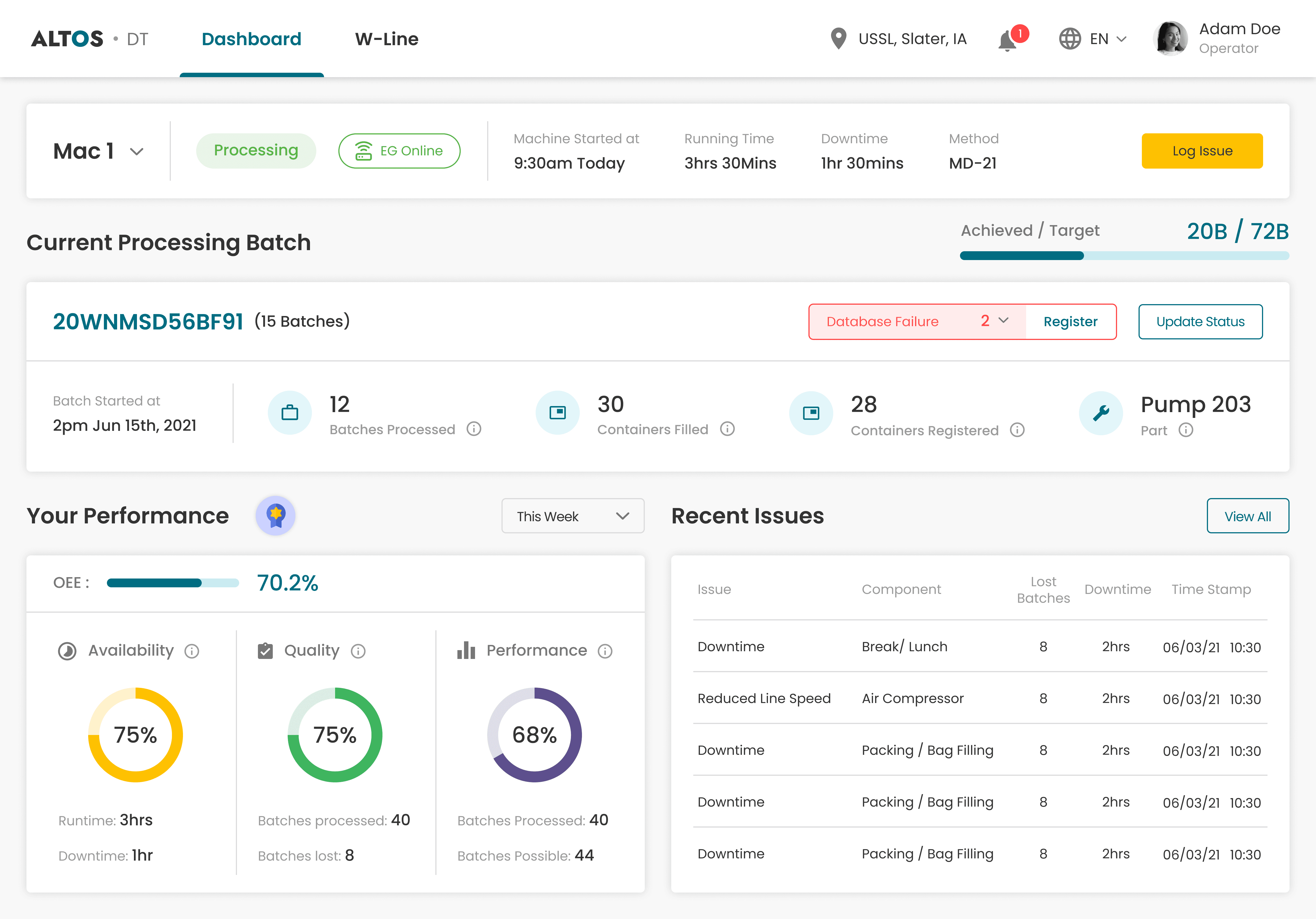
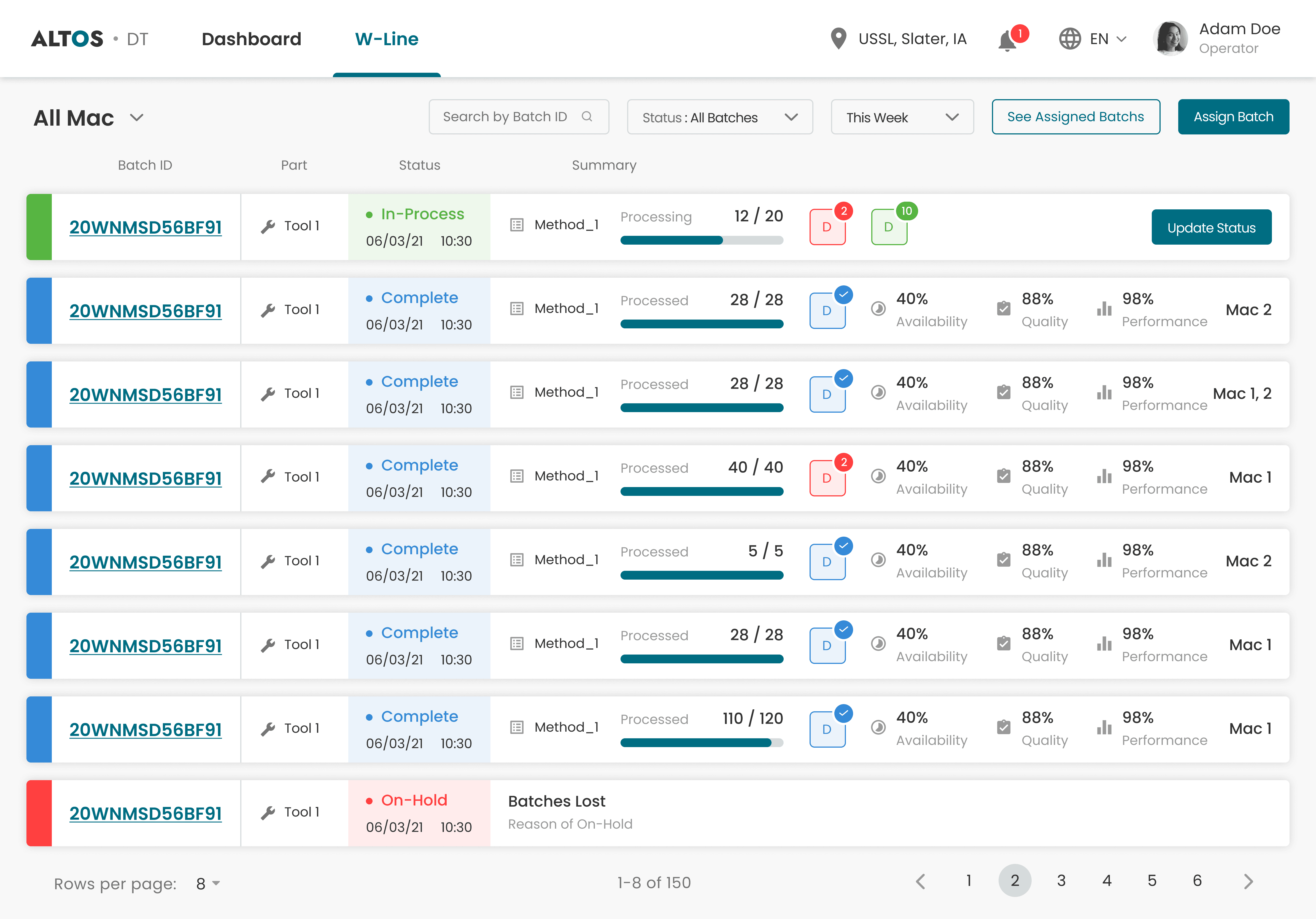
A separate screen handled batch management — status, overview and database registration update across all batches.
Automated Material Registration
Problem / Challenge
End-of-shift registration was manual, slow, and landed when operators had the least left to give - which meant consistent errors and missing records.
Automated material registration flow was designed that triggers after batch completion - the system pre-fills from IoT sensor data, and operators confirm rather than type from scratch.
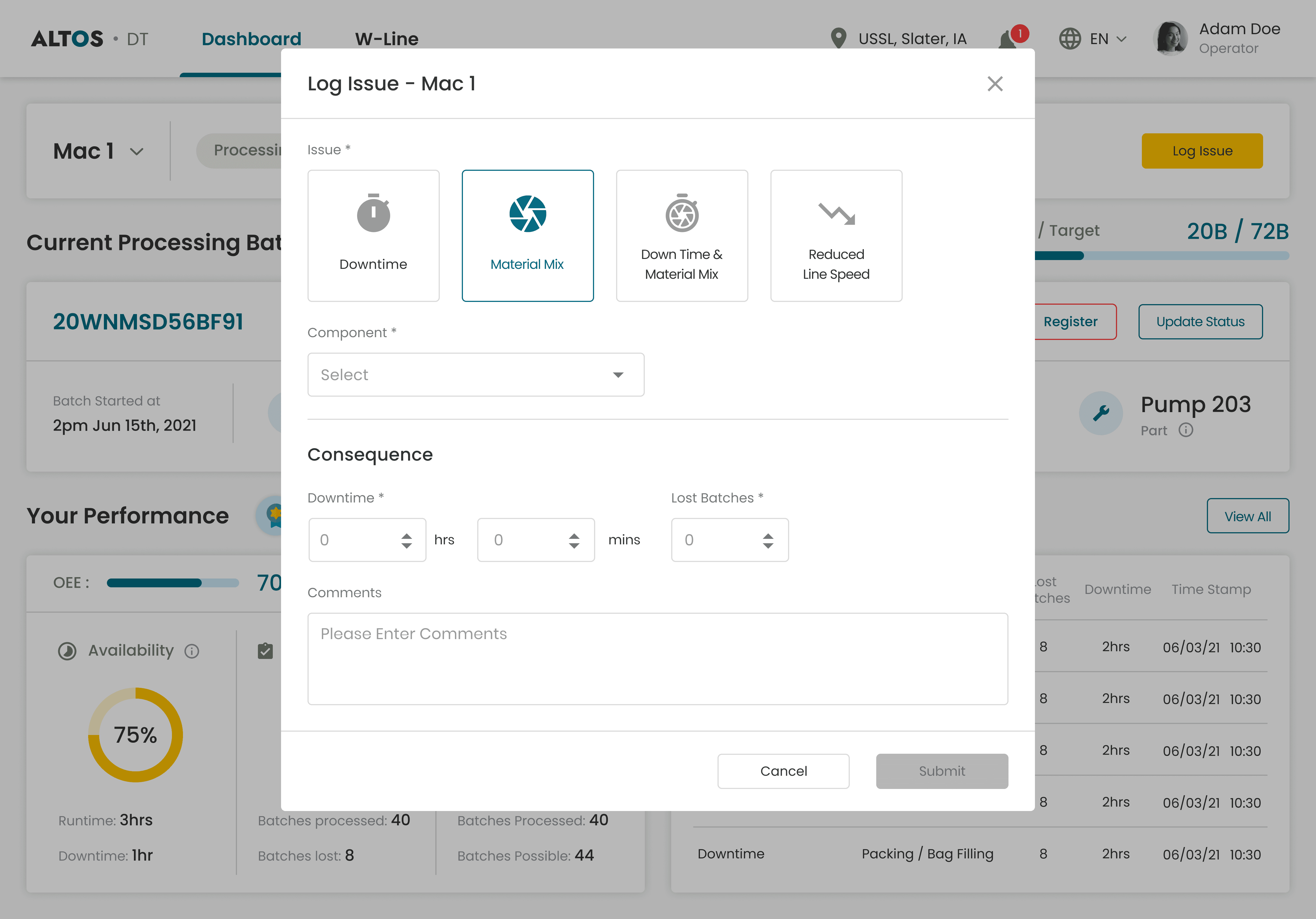
Structured Issue Logging
Problem & Insight
Operators weren't logging downtime consistently because the process felt unclear. No predefined categories meant they either made up their own or logged nothing at all. And without fields for quantified impact, even the logs that existed couldn't be tied back to OEE losses.
Four predefined categories - Downtime, Material Mix, Downtime & Material Mix, Reduced Line Speed - removed the ambiguity around what to log. Downtime and lost batches were required fields so every log captured impact, not just description. Comments optional. A valid log submits in under 30 seconds.
Plant Overview Visibility for Supervisors
Problem & Insight
Supervisors needed four answers to hit targets and OEE - plant performance, individual output, floor-wide batch status, and trial age. The data existed, but it was manually tracked and scattered. Nothing brought it together.
I designed a dedicated supervisor dashboard with four layers - Plant OEE, Operator Performance, Trial Status, and Average Trial Age - so stalled trials are visible before they become a problem.

Additional scope delivered - Executive & Admin
Those four decisions drove the headline metrics. But the product was also a complete solution for two more roles - real problems, fully designed.
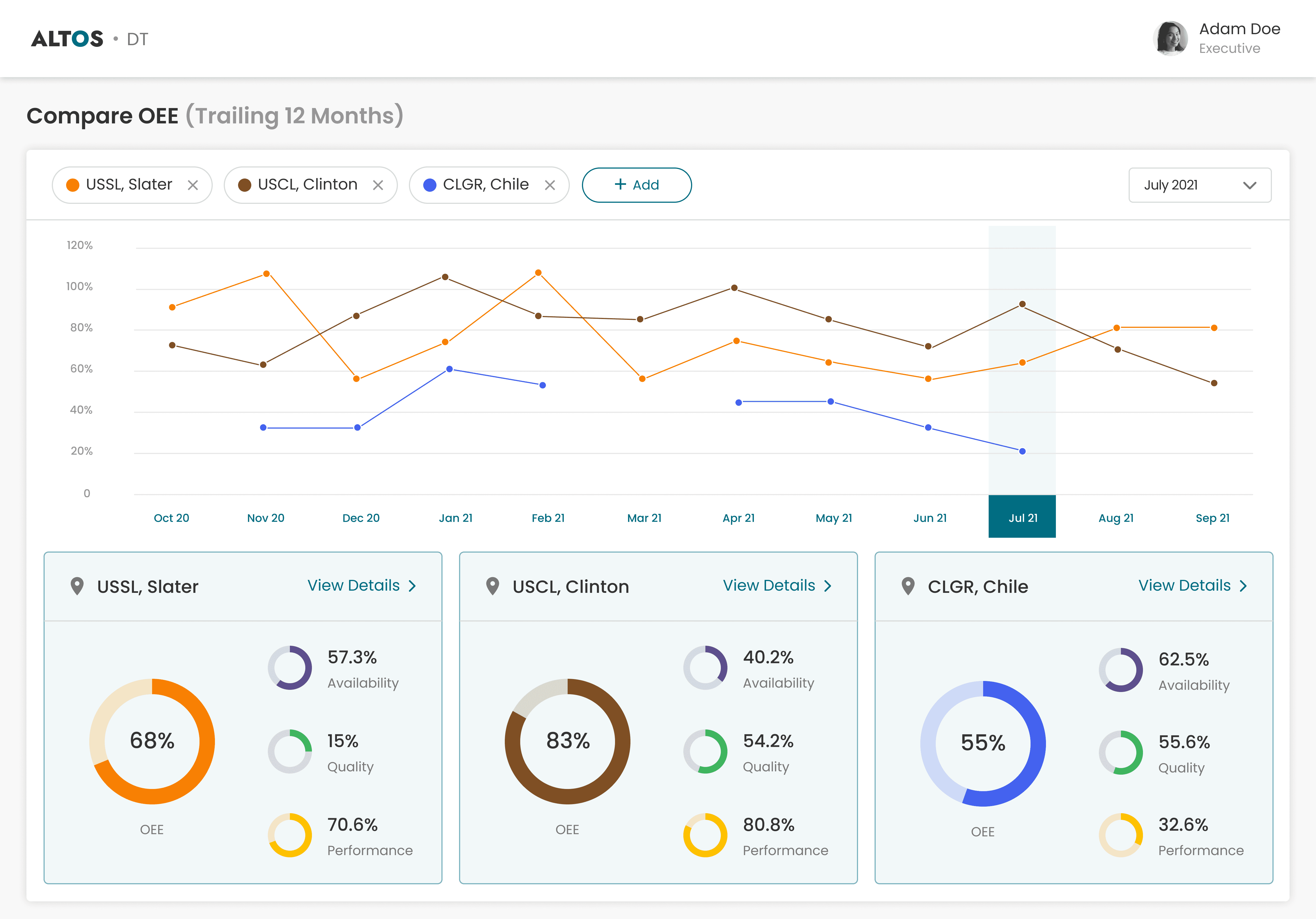
A multi-site OEE dashboard with 12-month trend lines per site and side-by-side comparison cards breaking down Availability, Quality, and Performance. Executives can interrogate cross-plant performance in real time and drill into any site, filtered by any time window.
Site and asset management - machines with brand, model, heartbeat, and PLC endpoints. Edge gateway configuration and certificate management. Centralised user management with role assignment across sites

Impact
Impact product delivered
The platform launched across 5 pilot sites - a controlled rollout to validate impact before scaling. The metrics below were measured against those pilots after Q1. The executive view gave leadership the visibility to assess cross-site performance and make the expansion decision on evidence, not gut feel.
OEE improvement achieved
CSAT increase from 66% to 84%
Manual registration errors
Role-based single source of truth
Supervisors started spotting operator performance patterns within weeks - enabling coaching conversations that weren't possible before.
Issue logging increased as the structured flow removed the ambiguity - giving the business its first reliable picture of what was actually causing downtime.
Impact held across all 5 pilot sites. OEE up, CSAT up, logging consistent. Leadership used the Executive dashboard to compare pilots, then made the call to scale. The platform expanded to additional sites at the end of Q2.
Next Case Study
Turning telecom data into a $5M Advertising AI platform.
From Innovation POC to $5M ads spend :
A Zero-to-One Product Story, Designing the UX for ad delivery insights & optimisation that handled $5M in ad spend within two quarters and 10+ Agencies, 15+ Brands onboarded
GTM - Lean UX
AdTech

$5M
Ad Spend
25+
Onboarded Ent.