Turning telecom data into a $5M Advertising AI platform.
Nextel had been sitting on one of Europe's largest first party telecom datasets for years. Over 75 million mobile contracts, 17 million broadband connections, and 4.5 million TV households, all real behaviour, not modelled estimates. And almost none of it was actually helping agencies plan better campaigns.
The problem wasn't the data itself. Every AdTech tool in the market claimed strong audience insight, but none of them could tell you what German users were actually doing on their phones or watching on TV, verified, at the cohort level. Nextel had exactly that. Consent based, GDPR compliant, first party. What it didn't have was a product that let agencies use it.
That was the real challenge. Telecom data comes with strict regulatory limits, you can't expose it at an individual level under GDPR. So the innovation wasn't just building a platform, it was figuring out how to turn raw, regulated telecom data into audience insight that stayed compliant while still being genuinely useful, by working at the cohort level instead of the individual one.
I led the product design and strategy for turning this into something agencies could plan campaigns on. What started as a rough internal proof of concept became a platform that reached 5 million dollars in ad spend within two quarters of going to market.

Role & Context
My Role & Other details
My Role
Lead Product Designer - Solely led product design & strategy
Team
PM, PO, Engineering (DS, DE, Development), Testing
Duration
2.5 Years (Mar 2023 - Dec 2025)
Tools
Figma, Dovetail, Miro, Umami (behavioural analytics), Lovable
The Business Opportunity
A data MOAT no competitor could match.
Every AdTech tool claimed strong audiences. None of them could tell you what German users were actually doing on their phones or watching on TV, verified, at the cohort level.
Nextel had telecom data from 75+ million mobile users, 17+ million broadband households, and 4.5+ million TV subscribers. Real behaviour, not modelled. First-party, consent-based, GDPR-compliant. The problem was that none of it was in a form that agencies could actually use
"Finding the right segments for a campaign is like putting together a puzzle. The tools that exist are either too generic or the data just isn't credible enough."
- Campaign Manager
Nextel's Data MOAT
75M+
Telco Customers - verified app usage behaviour
17M+
Broadband connections - web browsing patterns
4.5M+
Nextel TV households - viewing behaviour at zip-code level
First-party, consent-based, GDPR-compliant. No competitor had equivalent scale and signal quality in the German market.
What agencies were using instead
Meta Audience Insights - walled garden, no open web
YouTube / TikTok targeting - platform-limited
GfK / Similarweb - generic, no German first-party signal
TTD Audience Library - broad, not telecom-verified
User & User Problems
Three roles. All linked to each other
The platform served three tightly coupled roles across the brand & agency connection. Getting the design right meant understanding how each one worked, what they handed off to each other, and where the current process broke down.
The internal owner.
Sets campaign goals, defines KPIs, and reports results to leadership.
User Problems
Can't prove brand lift
Connect reach to CMO-level KPIs & insights
The bridge.
Translates business goals into media strategy and manages the client relationship.
User Problems
Too many fragmented platforms/channels.
Hard to build one coherent plan
Finding the right segments for a campaign
The executors.
Handles audience selection, platform setup, and real-time campaign optimisation.
User Problems
Finding the right segments for a campaign
Optimizing ad spend
Gaps in audience targeting setup
"How might we help advertising teams find the right audience, optimise their spend, and prove campaign impact from a single trusted data source without stitching together fragmented platforms?"
Product Journey
Three versions. Each one earned.
This wasn't a product that launched cleanly and scaled. We built it wrong the first time, figured out what was wrong, rebuilt it, soft-launched it at Cannes to get real feedback, and then spent three more months turning that feedback into something the market would actually pay for. V2 started specifically to challenge everything V1 had assumed.
Version 1
~1 Year
(Internal)
Innovation & Proof of Concept
V1 was never meant to ship. It was built to prove the idea was real and get funding for what came next. We explored a lot of ideas during this ideation phase. We also explored building our own DSP, but decided to drop. Integrating with existing DSPs was lower friction and faster to market. The demo landed. Funding was approved.
Proof of concept
Funding secured ✓
Version 2
4-5 Months
(Soft Launch)
Research-Validated · Cannes MVP
Before V2, we talked to actual users. Media planners, campaign managers, brand managers. What they told us replaced most of what we'd assumed. We soft-launched at Cannes Lions and gave the same build to the internal Admatrix team with behaviour tracking on. What users said versus what they actually did. Those two streams together became the blueprint for V3.
Research-backed redesign
Behaviour tracking activated
Cannes soft launch
Version 3
3-4 Months
(Market Launch)
Nextel Advertising Solutions · Market Launch
V3 stripped everything back to what people actually used. Search-first App Insights, a Germany GeoMap in TV Insights, an AI prompt interface replacing the manual audience builder, and Access Management rebuilt for agencies at scale. Then we renamed the platform, launched publicly in Germany.
Go to market Version
AI Layer
TV Geo
Research & Discovery
What assumptions the research broke.
Research came from three places. Before Cannes, I sat with actual users and asked how they worked. At Cannes, we watched agency stakeholders respond to live demos. After Cannes, I dug into behaviour data from internal users on the platform. Each stream told us something different. Together they gave us a clear picture of what to change.
Phase 1 · Pre-Cannes
Attitudinal Research
We interviewed 3 roles who represented the core users - a media planner, an internal campaign manager, and Nextel's own brand managers. The goal wasn't to validate what we'd built. It was to understand how they actually worked before we showed them anything.
Brand Managers
Media Planner / Strategist
Campaign Manager
→
Phase 2 · Post-Cannes
Behavioural Tracking (Analytics) & Cannes Feedback
We integrated Umami - an open source, self-hosted analytics tool - directly into the platform. It was the right call for a GDPR-compliant product handling telecom data: no personal data stored, fully privacy-safe, and gave us exactly what we needed - event-level tracking across every feature.
Admatrix internal campaign managers
Feature adoption & drop-off by module
Session completion rates per feature
Scroll depth & tab-level engagement
Phase 1 - What users told us (Attitudinal Research)
Three conversations stood out. Each one pointed at a different gap in what we'd built - and together they gave us a clear picture of where to focus.
Sabine Krüger
Brand / Marketing Manager
"My CMO wants to know if the campaign actually moved the numbers. I have reach numbers, I have impressions. But I cannot connect any of that to brand lift or business outcomes. I don't know what to tell her."
“Getting accurate insights & deep insights is hard and then mapping it with result KPI manually is like gamble”
Tobias Wendt
Media Planner
"I'm pulling data from five different places and trying to stitch together one plan that makes sense. Every platform tells me their audience is the right one. I have no way to know which one is actually true."
“Finding the right segments for a campaign is like putting together a puzzle. The tools that exist are either too generic or the data just isn’t credible enough.”
Jana Hoffmann
Campaign Manager
"I spend more time figuring out which segments to use than actually running the campaign. And even after I set it up, I'm never fully confident the targeting is right. There are always gaps I only find out about after the budget is spent."
“I can see that a campaign performed well in certain areas. But I have to manually figure out how to turn that into a new audience.”
Phase 2 - What users actually did (Behavioural Tracking)
We gave the Cannes version to the Admatrix team with Umami tracking live from day one. What it showed was uncomfortable.
Feature Adoption Rate
TV Insights
Audience Builder
App Insights - Overview
App Insights - Cross Browsing
Recommendation Tab
Critical Signal
88% TV completion rate
88% of TV Insights sessions ended with Export or Audience Activation - the highest completion of any feature.
0% audience creation from Recommendation 12% opened it. 0% created an audience from it. The tab was dropped entirely in V3.
42% scroll depth on App Insights
Users never reached Device Brand or Network Distribution - the bottom half of the screen was invisible in practice.
Phase 2 - Cannes event feedback - the room told us something
While the usage data came in post-Cannes, we were also getting live reactions from agency and brand stakeholders walking through the demos. One thing was consistent - whenever we showed the TV Insights screen and talked about geographic performance, the room changed. People leaned in, asked questions, wanted to know when they could use it.
Strong Positive Signal
The Geo concept for TV Insights
We showed a concept, not a built feature. Zip-code level geographic performance in TV Insights, connected directly to audience creation.
6 out of 8 agency stakeholders asked about geographic targeting unprompted. That was enough.
UX Gap Identified
App Insights couldn't be explained to a client
Multiple attendees said the same thing. Interesting data and no clear way to turn it into a client conversation.
The usage data was already telling us the same thing. It needed to get much simpler.
What the research proved - Findings that drove the product
TV
Geo targeting is a top-3 priority - not a nice-to-have
App Insights
App Insights need to be more precise that has actionable insights
Audience Builder
Segment logic clarity matters more than visualisation richness
5–10 segment options needed for comparison, not a single recommendation
Initial trust in segment quality is critical - first adoption depends on it
Overall
Export matters - media planners need a one-pager they can put in front of their manager to justify the audience choice.
Brainstorming & Synthesis
Unstructured to Structured Brainstorming
Once research closed, I ran a cross-functional brainstorming session before touching any solutions. The team split into Team A and Team B, each independently generating ideas from the findings. Nothing was filtered yet.
Every idea then went onto the board and clustered into three buckets: Data Sourcing, UI & Infra, and Activation. Dot voting surfaced what the team collectively saw as priority versus noise.
That output is what made the V3 decisions traceable, not just intuitive.


Key Pivots
Solutions & Decisions that shaped GTM.
Once we had interview findings, the behaviour data & Cannes feedback together, the priorities were clear. We made three big changes - each one traceable to a specific thing the research showed us was broken.
Each roles were linked to each other but also some features were specific to particular role so implement RBAC to access of features based on role.
01
TV Insights → GeoMap
84% adoption + geo demand from Cannes
02
App Insights Revamp
76% opened, 42% scroll, couldn't explain
03
AI Layer → Audience
AI integration to precise audience creation and drive app insights to audience creation AI suggestion layer.
01
TV Insights → Actionable geo intelligence
For Role : Only Campaign Manager
Why this feature
Apart from the problems (mentioned below) that we were solving, there were some signal that we got like 84% of users were opening TV Insights regularly. When we talked to agency people at Cannes, 6 out of 8 of them asked the same question: can I see where my TV ads performed geographically? James C. put it plainly - his company tracked over and underrepresentation by region on every campaign. If we couldn't show that, the tool didn't fully work for him.

Key Design Decision
Legends + segment filter unified to reduce cognitive load and also geo map got more real estate thus help CM analyse properly.
(Recognition over Recall - Nielsen Heuristics)
The pre-attentive colour encoding on the choropleth - Purple used for Below Average group as purple carries a "negative/attention needed" connotation + been primary CTA color, while Green used for Above Average group as green reads universally as "performing well." Also maintaining contrast ratio with each other & background.
(Gestalt: Proximity & Similarity)
Followed Familiar layout pattern from other analytical tool CM used Google analytics, Salesforce, Tableau to reduce Cognitive Friction on understanding UI and arrive with a ready mental model.
(Jakob's Law)
Outcome
73% of TV Insights users went to the Geo Segments tab in their very first session. They spent 14 minutes on average there, compared to 8 minutes on Contact Class. And 58% of all segment creation requests came directly from the map - it became the main way people started building audiences.
02
App Insights - from data dump to actionable entry point
For Role : For all 3 roles - Brand / Marketing Manager, Media Planner, Campaign Manager
Why revamp
2 Feedback said the same thing - Feedback from Cannes : that data is Interesting but getting actionable insights is hard and too much data, thus can't be explained any of it to client. Behavioural Analytics : 76% of users opened App Insights but barely half of them scrolled past the first few widgets & 12% never opened Recommendations tab.
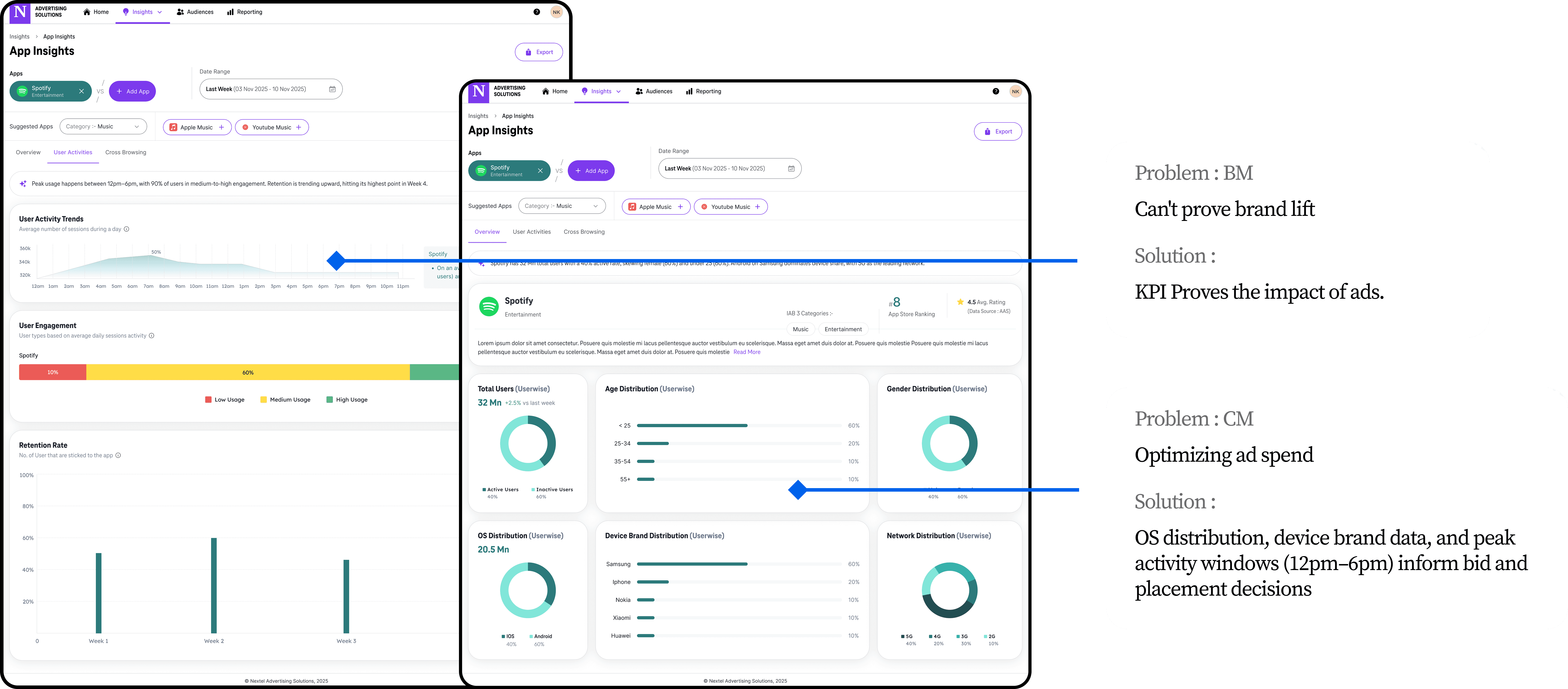

Key Design Decision
The three tabs are sequenced to match how a media planner actually thinks: who is the audience, how do they behave, and where else can I reach them. This means users always arrive at complex data with enough context to act on it, rather than being overwhelmed upfront. The result is faster decisions and higher confidence in the insights the platform surfaces.
(Tab-level progressive disclosure)
Most dashboards dump charts and make the user do the thinking. Here instead, I opened every screen with a plain-language AI summary that delivers the headline insight before a single chart is read. This tells the user what matters in one sentence. The charts below then exist to support and validate that insight.
(Lead with the insight, not the data)
Outcome
After launch, agencies started including app data in client presentations for the first time. The simplified view made it something they could actually explain. Time to first meaningful action dropped. And the Twin App Report became the feature people specifically pointed to as useful for planning.
03
AI Layer (AI-driven prompt-to-segment + Audience Suggestion on app insights)
For Role : For all 3 roles - Brand / Marketing Manager, Media Planner, Campaign Manager
Why AI feature
The V1 audience builder required manually wiring together Include/Exclude rules - apps, interests, usage intensity, time of day. Julia S. was literally using Perplexity and calling data colleagues to figure out which segments to build. So we wanted to reduce effort in precising audience input by removing manual filter and also AI will give flexibility input and help with more accurate audience creation.


Key Design Decision
AI Layout - Most AI tools default to Conversational UI because it feels modern. But chat is the wrong choice for picking audience segments. Segment selection is about comparison. Users need to see all options at once, weigh reach and price side by side, and watch totals update as they choose. A chat interface makes that impossible. So we used language input to capture what the user wants, and a visual grid to let them pick. Each does the job the other cannot. AI maturity is not adding a chat box everywhere. It is knowing when AI helps and when a clear, structured UI does the job better.
The AI Audience suggestion feature removes a multi-step mental journey where users had to analyse a chart, hold the insight in working memory, navigate away, and reconstruct the context from scratch in the audience builder. Classic gulf of execution. Now the system closes that gap. Audience suggestions surface right where the insight lives, reducing the steps between understanding and action to almost zero thus reducing cognitive load.
Outcome
71% of people who typed a prompt completed the whole audience creation flow. On average they picked 3 segments from the 6 suggested. 52% went back and changed their prompt after looking at the Reach vs. Affinity chart - which told us the chart was actually doing something useful, not just decorating the page. 68% of audiences made it to the DSP within 48 hours.
My Role in Product Strategy
Beyond the design - where I shaped.
My title was Senior Product Designer, but the work went beyond design execution. I was part of the room for the strategic calls that determined what the product was, who it was for, and how it got to market. Here are the ones that mattered most.
01
Pushed to drop the DSP idea early
I argued against building our own DSP, not because of engineering cost, but because of onboarding. Asking agencies to move their campaign execution to a new platform is a very different ask from giving them better data inside the DSP they already use. We integrated with TTD instead. That decision shaped the entire GTM approach.
02
Proposed the research sprint before V2 and ran it
After V1 got funded, the team wanted to start building. I pushed for 4 to 5 weeks with actual users before committing to a direction. V1 was built on assumptions and I didn't want to repeat that. I led the sprint, ran the interviews, and turned the findings into the priorities that shaped V2.
03
Treated Cannes as a live test, not a showcase
I argued we should ship behaviour tracking alongside the demo so we'd leave with real usage data, not just applause. By the time V3 went to market, the risky bets had already been tested against actual behaviour.
04
Used data to reposition the product before launch
TV Insights was at 84% adoption. App Insights had steep drop-off and zero audience creation from the Recommendation tab. I used that to argue for a full repositioning. TV Insights and the GeoMap should lead commercially. App Insights should be simplified and supporting. That changed V3's priorities and how we pitched to agencies.
Outcomes & Impact
What two quarters looked like.
The numbers came faster than we expected. Within two quarters of launch, $5M in ad spend revenue had moved through the platform, 10+ agencies were onboarded, and 15+ brands were running live campaigns. The features driving that adoption weren't the ones we'd originally planned to lead with - they were the ones we built because the research told us to.
$5M
Ad Revenue
Processed through the platform in the first two quarters - ahead of the original GTM target.
-30%
Campaign Setup Time
Two main factors were key top notch insights & Audience creation AI & Suggestions that helped Campaign Manager.
25+
Agencies Onboarded
Across automotive, retail, and media. 25+ Agencies, 240 total users, 210 advertisers on the platform at time of reporting.
One tailwind we didn't fully anticipate: the industry was shifting hard toward video - from 70/30 banner-video to 60/40 video-banner. Netflix opening up to TTD programmatic buying right around our launch created a premium inventory opportunity that our telecom-data-backed segments were uniquely positioned to capture.
Next Case Study
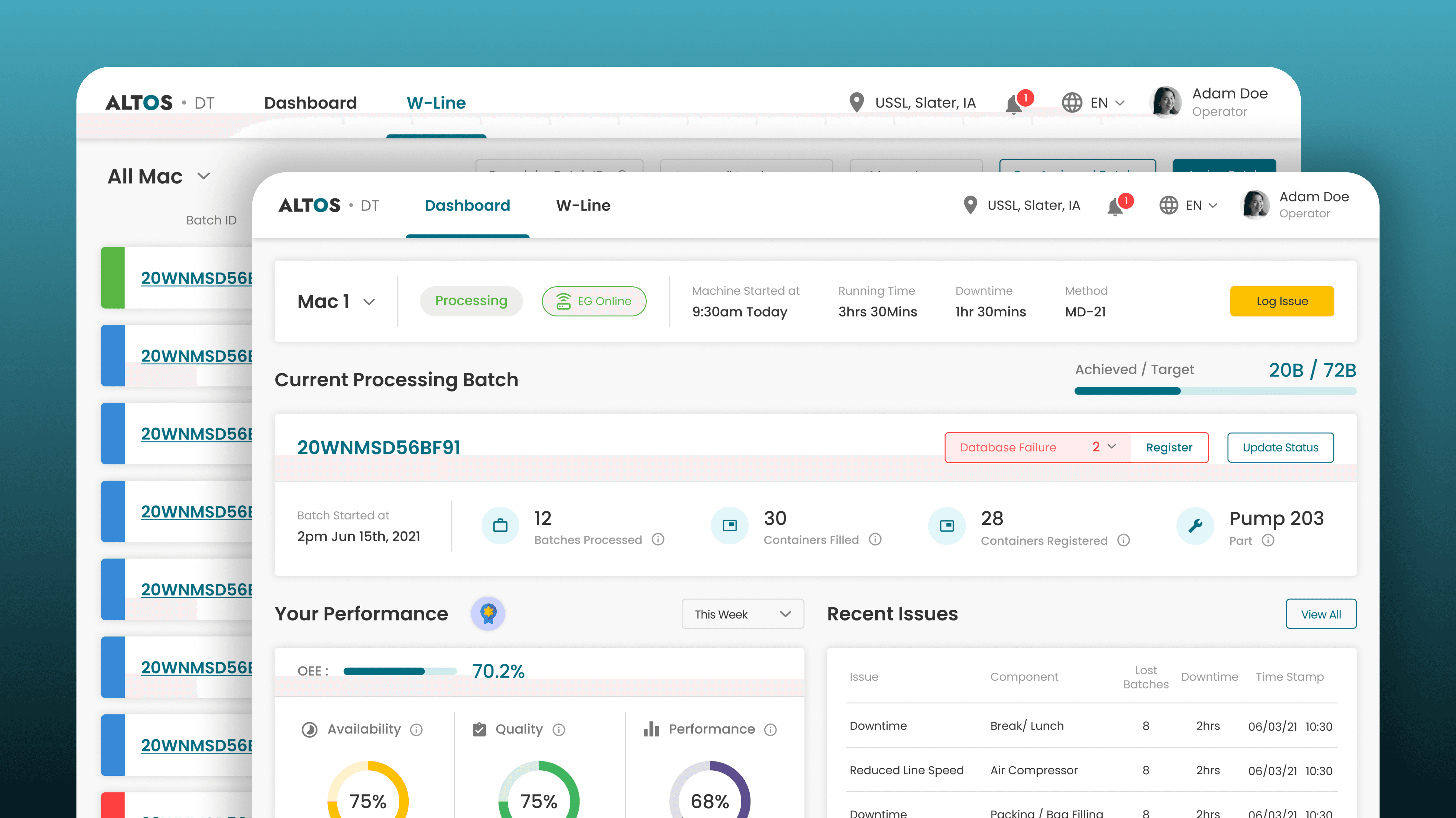
Replacing factory floor guesswork with clarity, driving +8% OEE.
Designed the digital system that replaced guesswork with clarity - giving operators, supervisors, executives, and admins each the right view of the floor, built for their altitude, to increase OEE and CSAT.
Linear Design Process
Industrial - IoT
+8%
OEE
18%
CSAT Increase